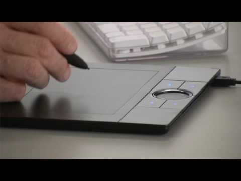
I thought I would write this post in case anybody might be interested in the process behind the informational doodle posters I design for Productive Muslim. It’s not quite a tutorial or guide, because I am just making things up as I go along. Since the bulk of the work is drawing the little graphics/icons, let the video first introduce you to something called a Wacom tablet, which happens to be a drawing tablet:
My tablet is not of the Bamboo models shown in the video, but a much older one called the Graphire3. It works the same way, though it just doesn’t have any buttons or fancy finger-scrolling. I have had mine since I was 15 years old so Alhamdulillah, using it is as a mouse is second nature to me.
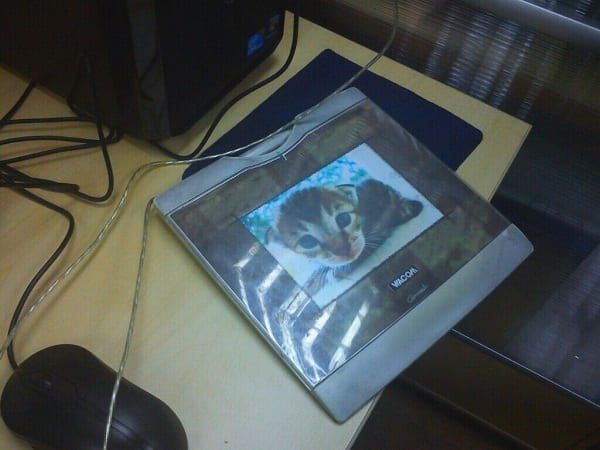
Now, many designers and artists work just fine using a mouse. Drawing vector graphics, for instance, probably works fine without a tablet. But you might find that a tablet is much kinder to your wrist and fingers, and also certain styles (doodles/hand-drawn/traditional-look) are more difficult to produce without a tablet.
I will be taking you through a few examples of the doodles I have done so far and mentioning whatever I think might be helpful.
Doodle #02: Commuting
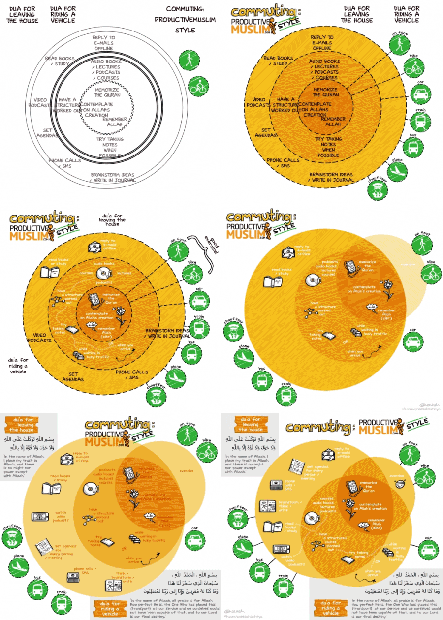
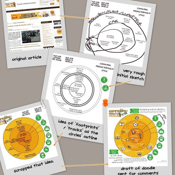
It always starts with the written article and the text extracted from the article. I do this because text takes up space, sometimes a lot of space, and so they dictate the layout, more or less. In this case I already had a “Venn diagram” concept in my mind, based on how the article was structured, so I arranged the text to correspond to such a diagram.
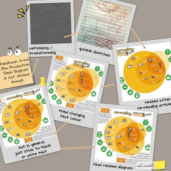
As I wrote on Facebook, “Feedback and rethinking/revising is quite important. I guess there is an intelligence to knowing when to pause, continue, or stop the design process. I’m still learning a lot with each attempt.”
I cannot stress enough, the importance of feedback and comments. It is OK to not be sure whether this is right or if that is clear enough, just finish up the option (or make several options) and have others take a look, something learnt in Architecture. I have read that it is important for the designer to step back and away from the piece for a little while too, before working on it again. Most of my doodles are done in at least two sessions, which could be two separate days, or two nights, or two chunks of several hours of work.
Doodle #04: 7 Spiritual Productivity Habits
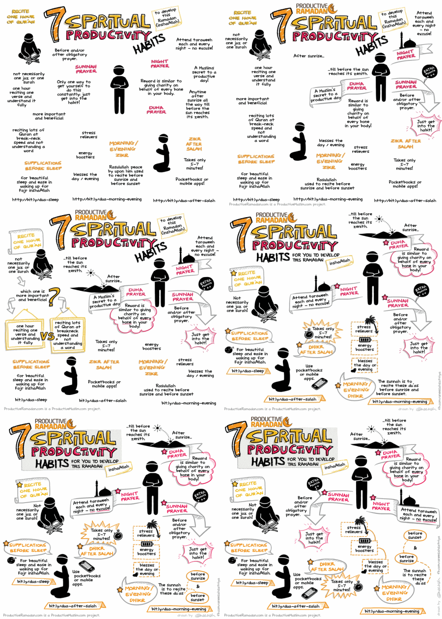
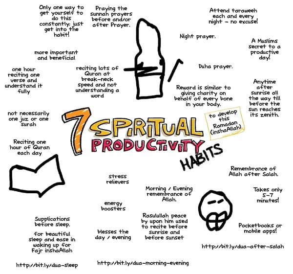
I always pretty-up the title first. The layout was just a floating mind-map style. This doodle was after I discovered the wondrous works of graphic facilitators such as Brandy Agerbeck, and I took some pointers from her style of work.
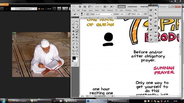
Here is another not-so-secret in the designing world: Google Images. Now, it is never okay to simply take photos from Google (or Flickr, Facebook or deviantART unless the picture is specifically stated to be stock photo or licensed to be freely used) and stick it into your poster/work/piece, but I have always believed that referencing is okay and good. I am not producing original artworks but drawing icons to visually express some points. So what I did was just open the image side-by-side with Photoshop and draw the graphic I want based on the pose of the reference image. The reference image never makes it into the final piece.
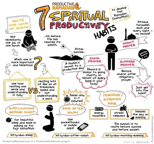
Then I sent a draft for comments. Figuring out the icons for each point is sometimes simple, but other times not so straightforward. I am sure icon-making is another science altogether, so for now I am just learning by doing (and by Google-Images-ing), or adapting the doodle based on how “graphical” the article can be converted to.
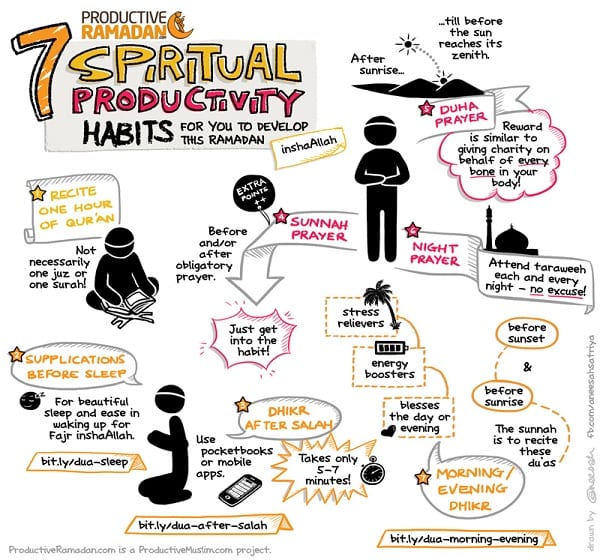
One of the comments from Abu Productive was to discard some chunks from the “Recite one hour of Qur’an” point, so that necessitated a layout overhaul to fill in the gap and make things look balanced again. I still don’t think the overall composition is as nice as the unedited draft. Usually with this “floating” style, the stuff you draw sort of naturally fits like a puzzle the first time around, but it is okay.
Doodle #05: 8 Easy Steps to Finish Qur’an
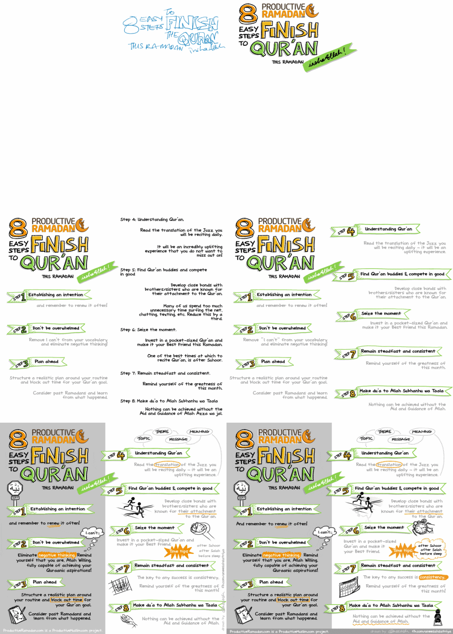
Animated walkthrough. This time I sketched the title first before drawing it, which is rare for me.
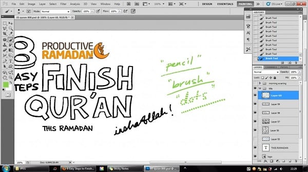
These are the three common Photoshop Brushes I use. The ones I call “pencil” (textured, looks like crayon) and “brush” (smooth) are default Photoshop ones while “dots” is probably a modified default brush with adjusted spacing. If you have been dabbling in digital drawing/painting you ought to have your own collection of brushes that you often use. There are tutorials out there about the organisation of brush presets and making your own brushes and such.
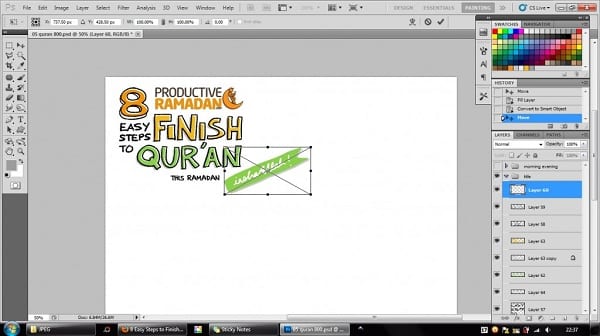
I want to stress the importance of keeping your workspace and layers organised, particularly using Layer Sets and labels. This screenshot shows me converting that green ribbon with text into a Smart Object, a feature in the newer versions of Photoshop. You edit it in a separate file, with the layers in it, so if there are multiple copies of the object in your main canvas, they are updated automatically. Also, smart objects appear as one layer in your main document so that simplifies things. One more point — you can transform (rotate/shrink/flip/etc.) smart objects multiple times and it will re-render itself nicely without going all fuzzy and compressed. However, Smart Objects do significantly increase the file size.
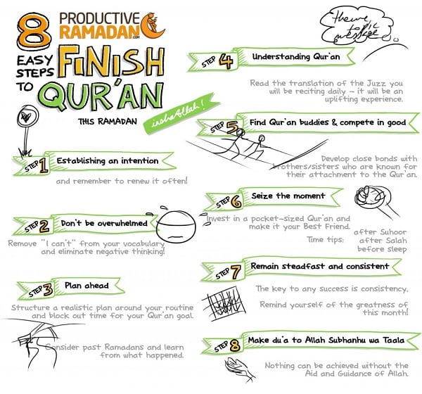
List-style points and sketched icons. Some of the ideas for icons were changed afterwards.
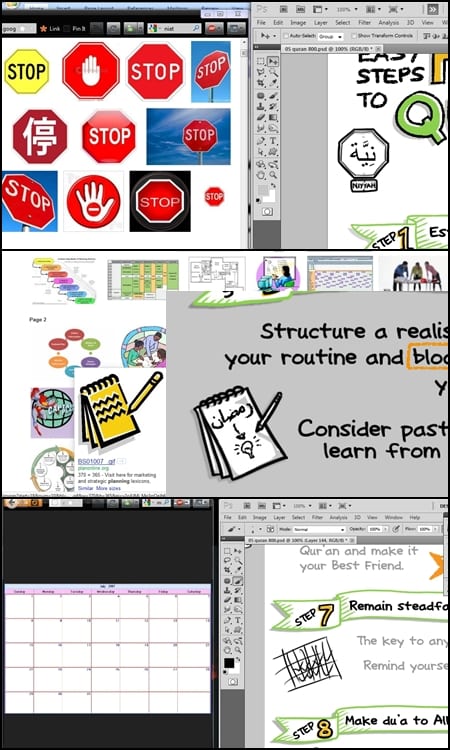
Google Images galore.
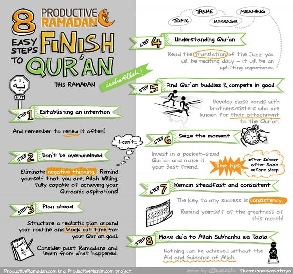
Finished version.
Doodle #06: Iftar Party
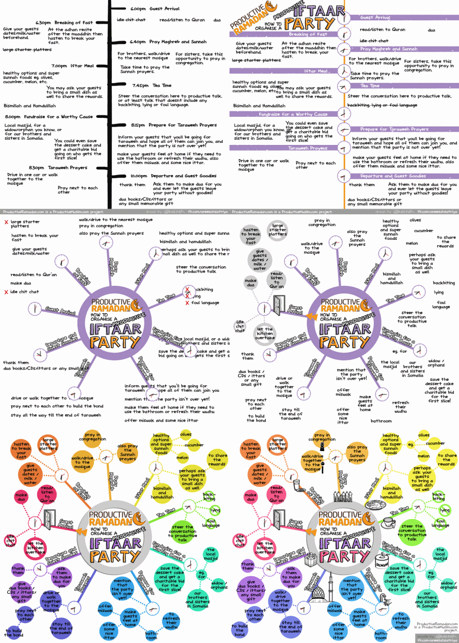
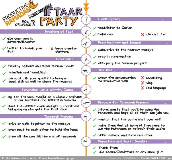
This was the point where I stopped and decided it was not working. Abu Productive had a good idea: “the only potential difference I see is to have a massive clock in the center and the different things you would do around it?”
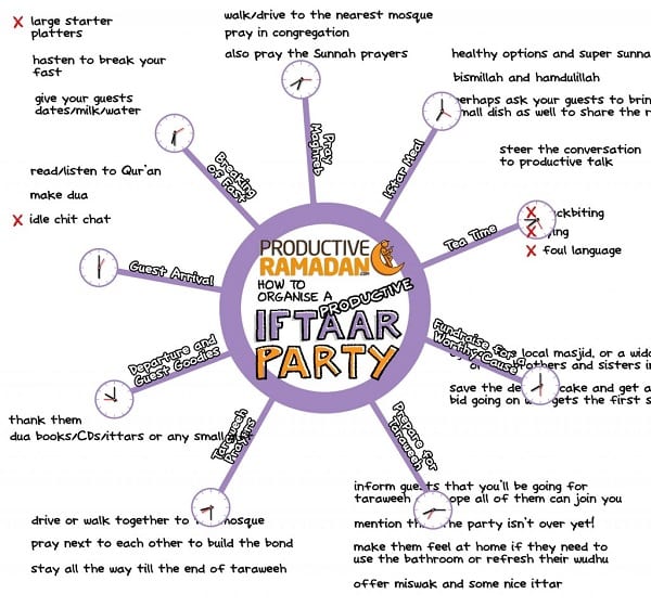
So I adapted the idea and made a rough layout.
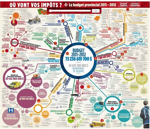
The style of the outer points was inspired from a brilliant infographic. I not only Google for specific images but for mindmap/infographic resources too. I save them on a folder on my computer, sometimes categorised according to the style of diagram I need to do. I also learnt this from my studies in architecture: ideas don’t come out of nowhere. And you don’t have to reinvent the wheel.
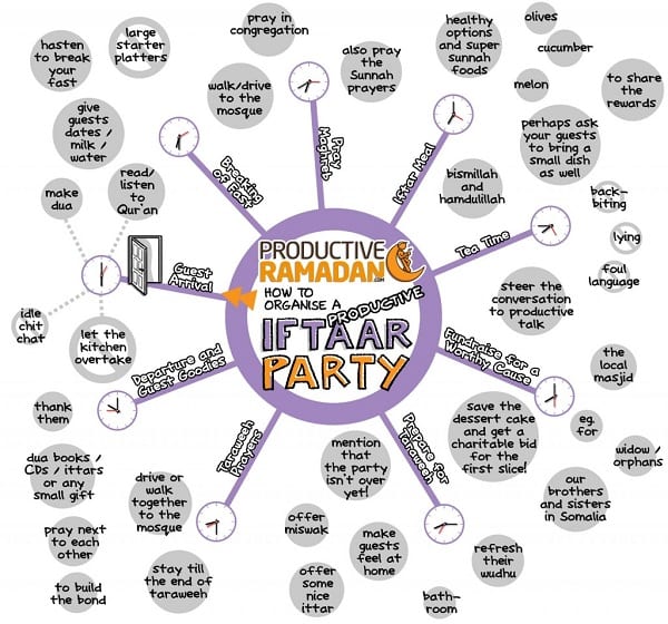
As you can see, there was a bit of a colour issue, which then drastically changed.
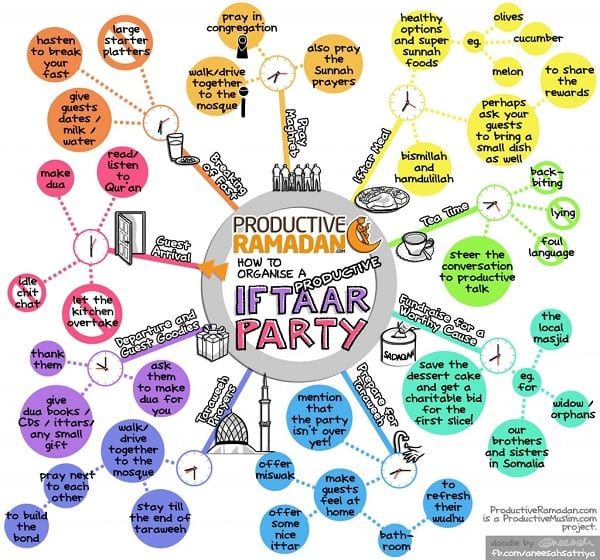
I was a bit concerned that I went too “wild”, but they said it suited the party theme, so Alhamdulillah.
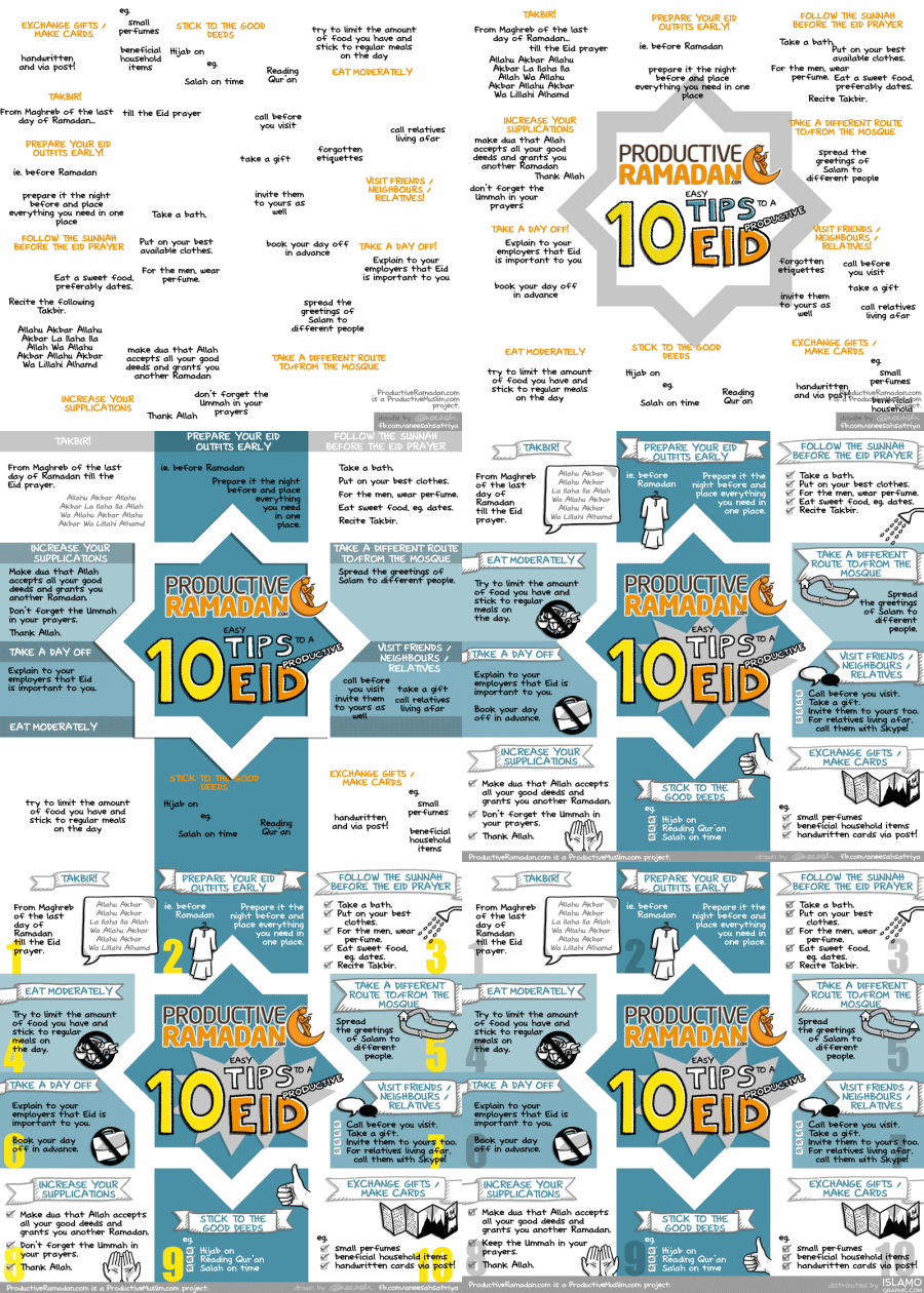
Doodle #07: Tips to a Productive Eid
Doodle #08: Eid Mubarak

Finally, just to make it clear how parts of the doodle are “hand-drawn”, the second video is a screen-capture. I was really reluctant to record my screen in any of the doodles, because 1) it will make me super self-conscious and probably mess things up more than I would do normally and 2) I am not an “artist”, I am not proud of how I abuse the Ctrl+Z shortcut. This is me drawing out the title for the above doodle, but at 4x the actual speed. Manually, without guidelines, just by eye. Later, I copied each letter on its own layer to rotate them.
I sincerely hope this was at least a little beneficial in one way or another. I have only been doing this for five months at the time this is being written, but am very thankful for the opportunities and for the crazy support so far, Subhanallah wa Alhamdulillah. All this stuff works in whatever media too, really a simple pen and paper are perfect for some people!
Please feel free to add on your comments below!
